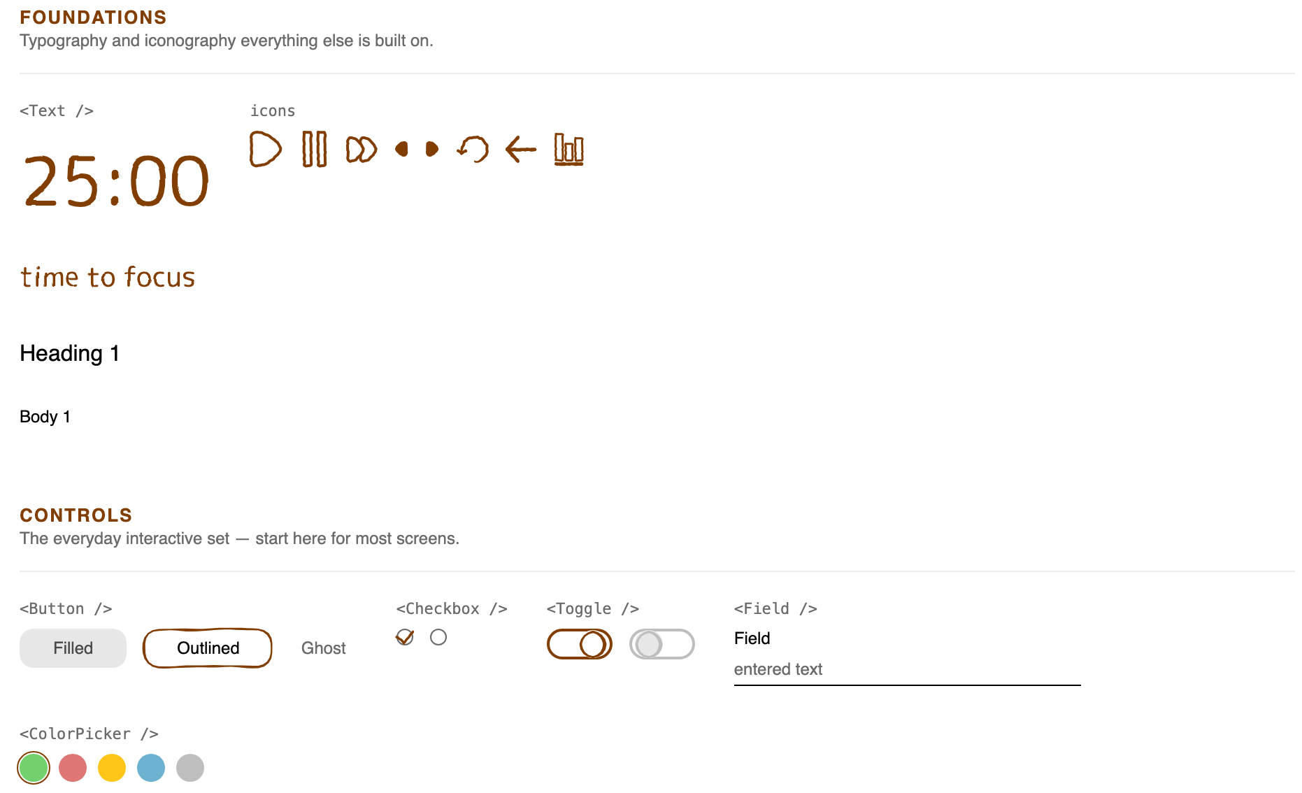
I DO NOT want AI-generated capybaras. So I drew my own — then figured out how to get AI coding tools to build them without flattening everything into generic UI.
- role
- Solo — product design, illustration, design system, AI-directed front end
- timeline
- Component library built July – August 2026
- methods
- Competitive research, sketching, design systems, AI prototyping, design QA in Storybook, accessibility review
- tools
- Illustrator, Figma, Cursor, Figma MCP, React, Base UI, Storybook
- links
- Live Storybook · GitHub · wobble-svg on npm
Context
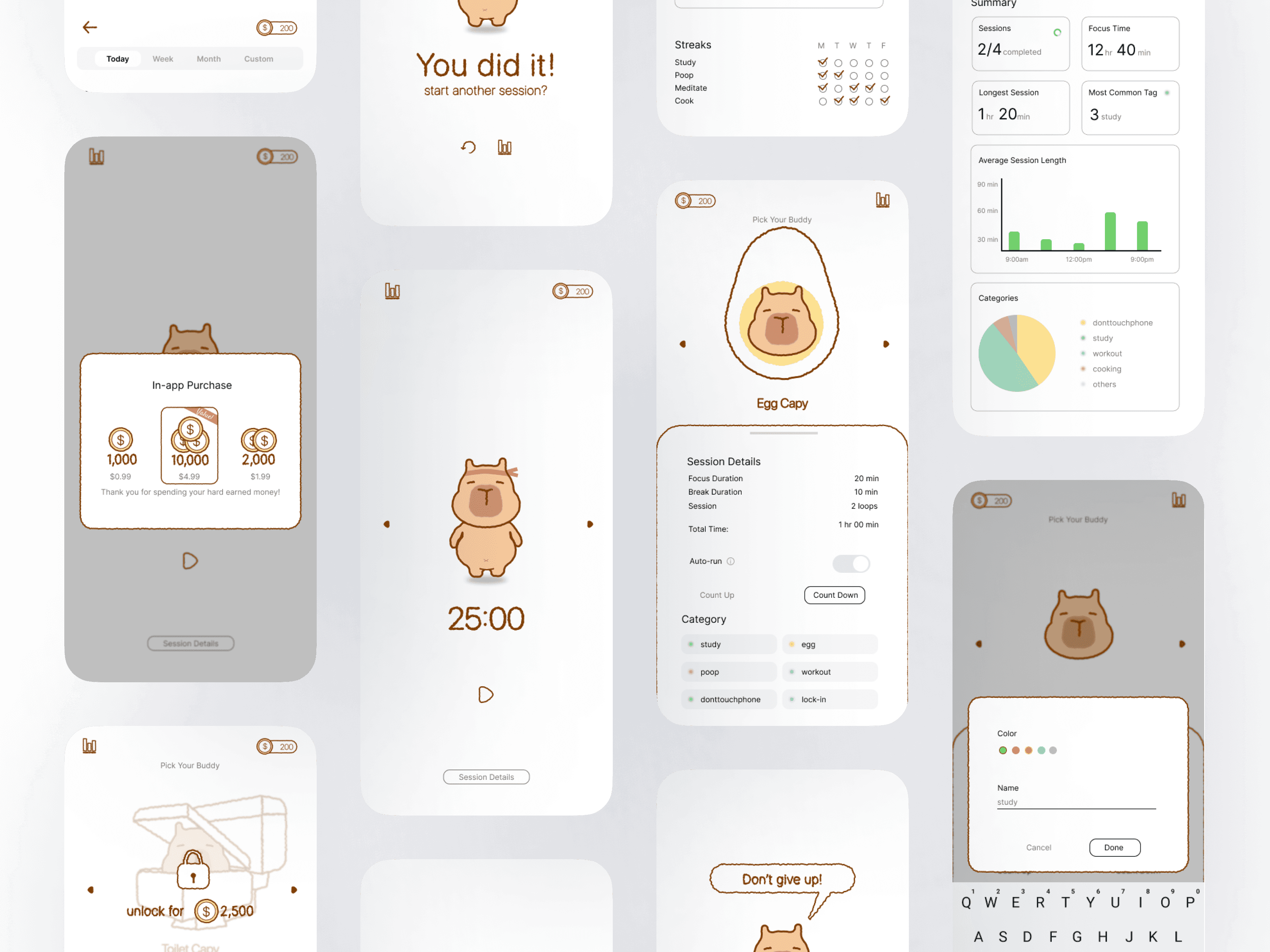
capy timer is a pomodoro app for building habits over hitting goals — for a community that doesn't judge you for a slow day. Its capybara companion is the whole point: a friendly face that keeps you company while you focus. capy-ui is the design system that app is built from.
The problem
- Generic AI art. AI capybaras were all over my ads and apps — with the wrong number of toes (it's 4 in front, 3 in back) and guinea-pig snouts.
- Generic AI code. Every AI coding tool I tried turned my hand-drawn system back into stock UI, so the companion stopped feeling like a companion.
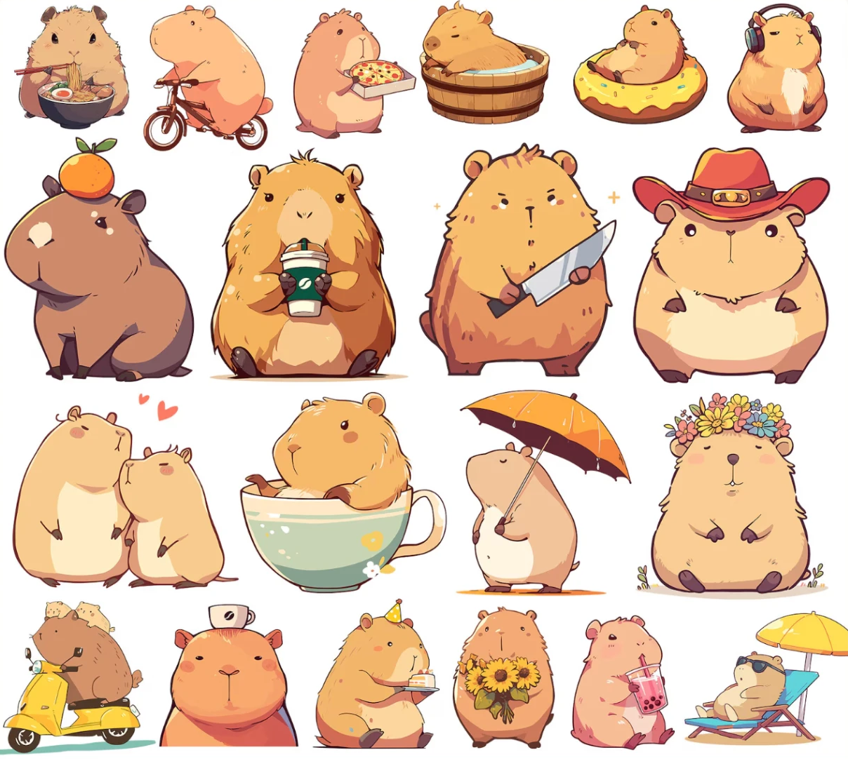
- Paws, not feet. Stubby, toeless paws. Real capybaras have 4 toes in front and 3 in back.
- Guinea-pig snout. A short, round muzzle instead of a capybara's long, blunt, boxy one.
- A hamster build. Round ears and a round, chubby body — more hamster × guinea pig than capybara.
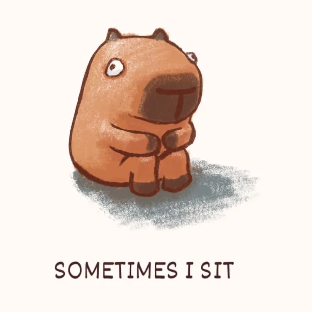
Research
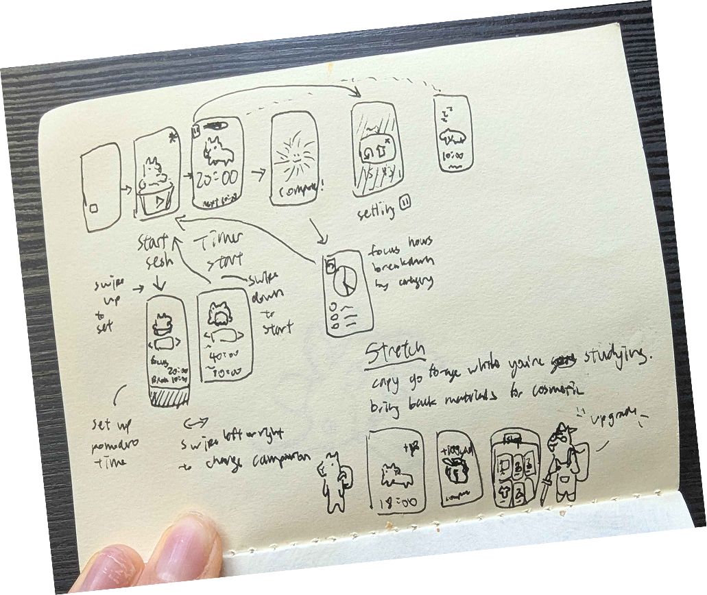
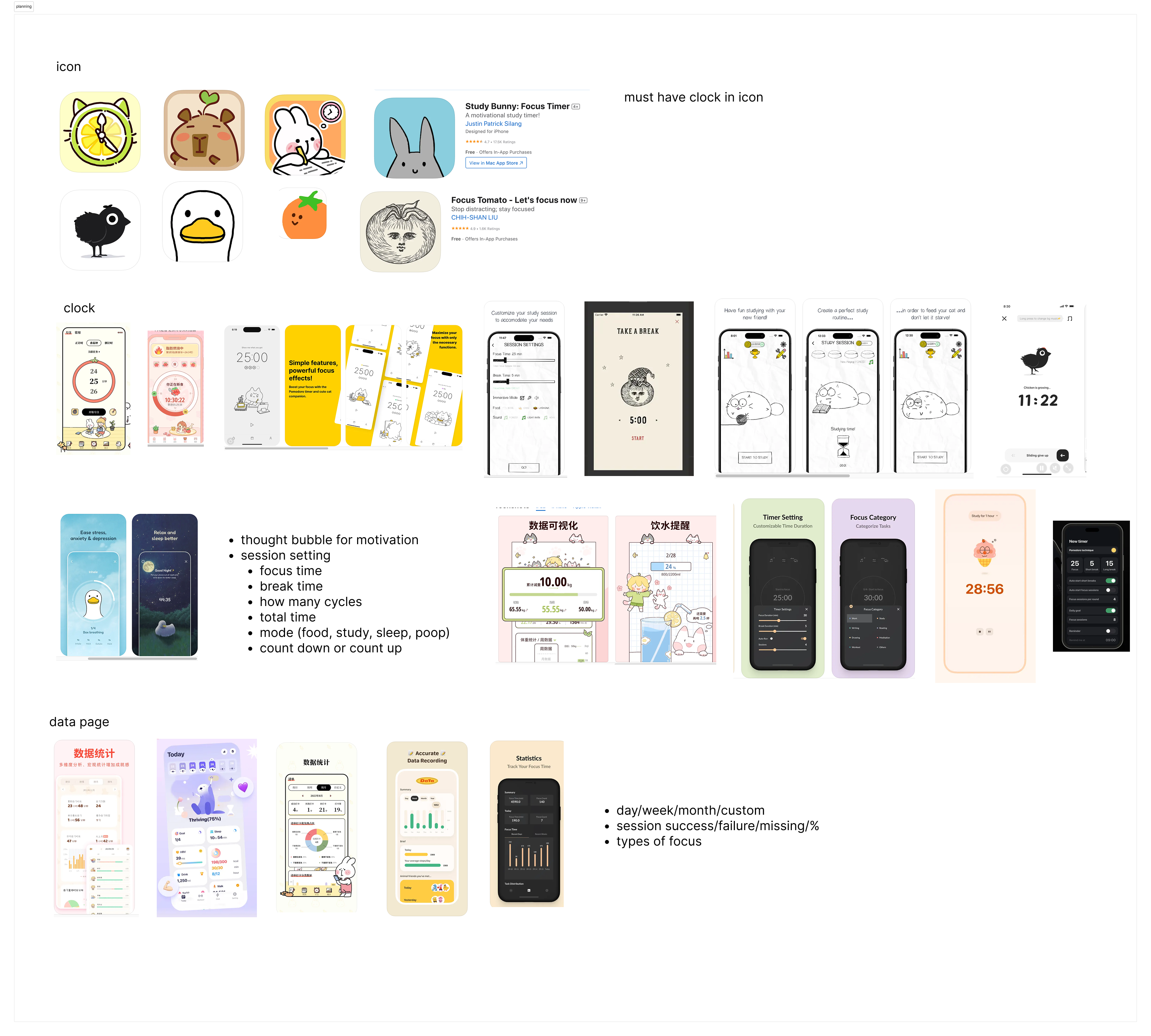
I sketched the flow first, then audited the focus-timer apps I liked — their icons, clocks, session settings and stats pages — and noted what the app couldn't do without.
- A timer needs to read as a timer at a glance — every icon worth keeping had a clock in it.
- Sessions are personal — focus time, break time, cycles, count up or down, and a mode for what you're focusing on.
- Stats need a time range and a verdict — day, week and month views, with sessions completed vs. missed.
Users and requirements
| Someone who… | needs… | so the design… |
|---|---|---|
| is starting a focus block | to start in one tap, with no setup | opens on the timer, with the capybara and one big number |
| is losing steam mid-session | encouragement that isn't preachy | lets the capybara say it, in a speech bubble |
| checks in at the end of the week | to see progress without guilt | shows streaks and time by category, not a failure rate |
Iterations
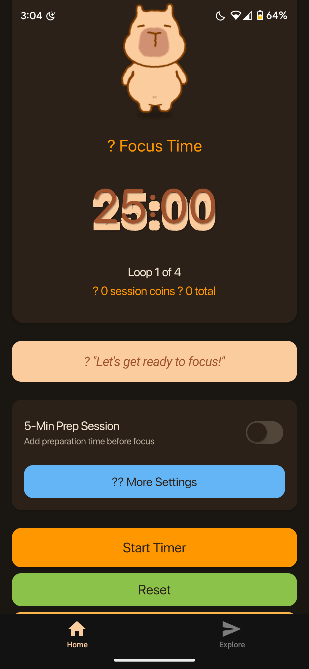
1. From Figma to code — three tries. Screenshots into Cursor set up React Native but rebuilt my screens in stock UI. MCP let the agent read Figma directly and fixed the layouts, but custom components still fell back to generic buttons. What finally worked was a React component library in between, checked in Storybook.
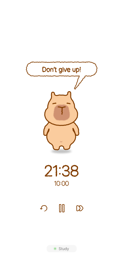
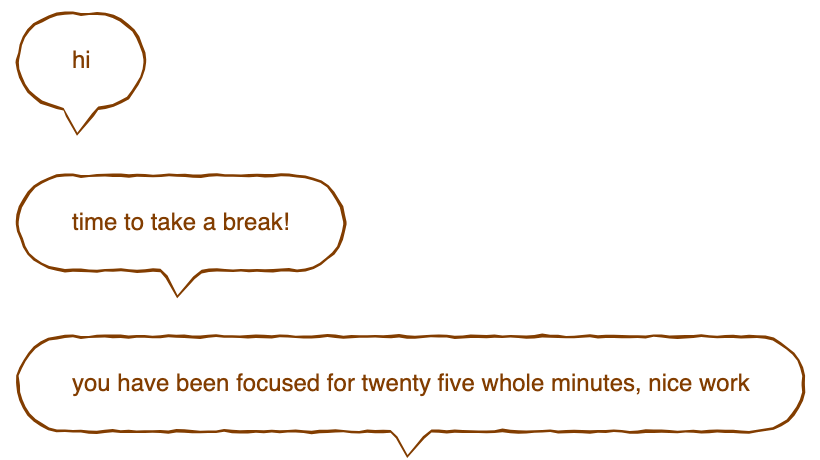
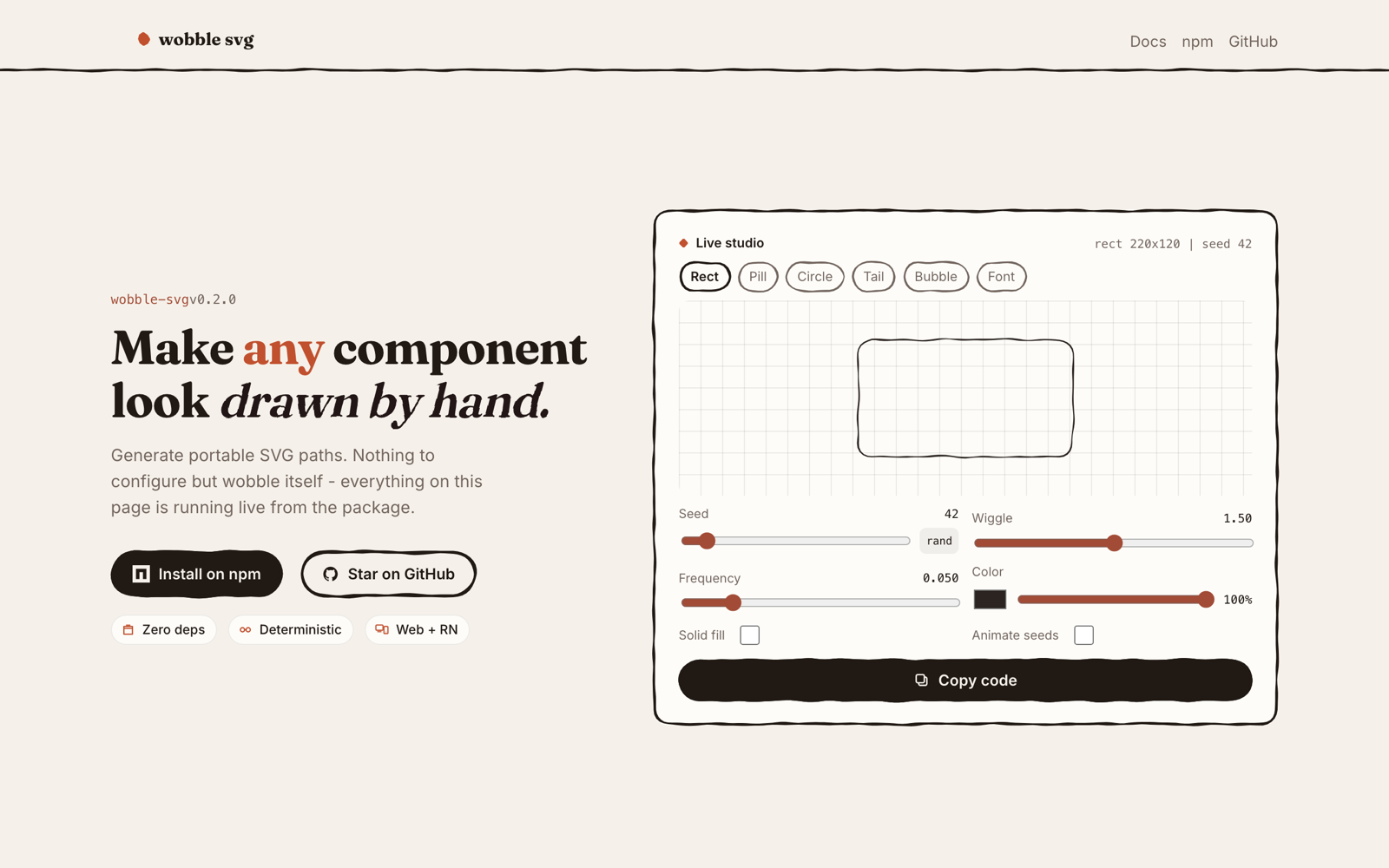
2. The speech bubble, three ways. A tiled border-image couldn't stretch with its text; an SVG filter could, but React Native can't render it. Generating the outline as geometry works on both — and became wobble-svg.
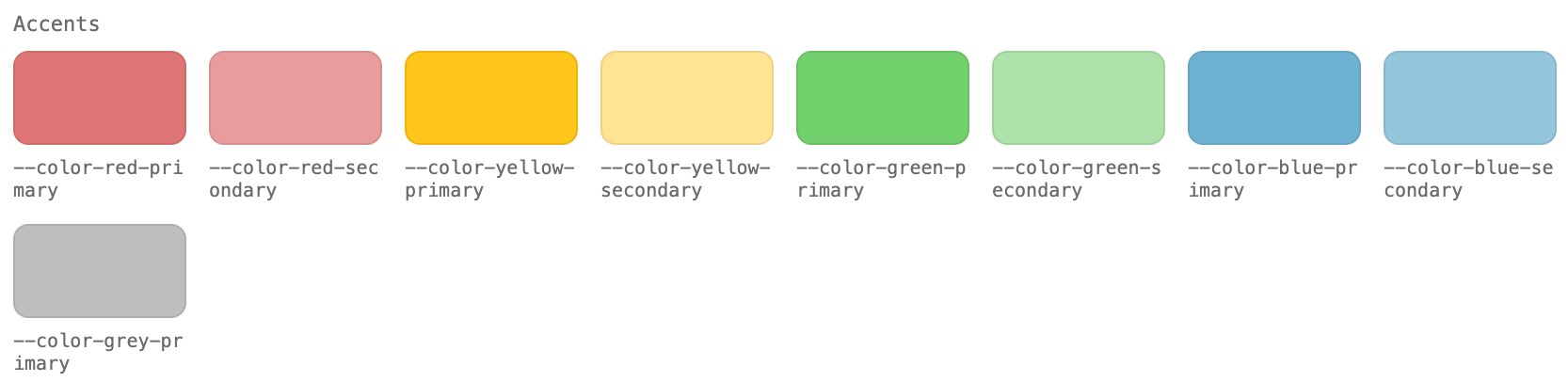
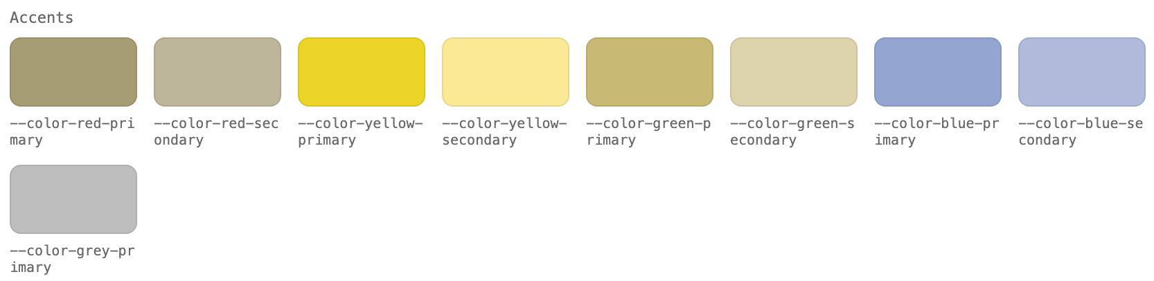
3. The palette. I picked pastels for coziness, and their contrast all read the same. The moment it clicked: a developer who's color blind couldn't tell which tag was which, and my button states used a gray far too light to read. I raised the contrast, added the button states I'd skipped, and made disabled states legible — and I'm adding icon shapes to categories, so color is never the only signal.
Decisions
Hand-drawn assets over generated ones
I drew the capybara as native vectors in Illustrator — turnarounds, variations and keyframes — instead of generating it.
why
The companion is the product. If its anatomy is off, it reads as cheap clip art, and the app loses the warmth that makes people come back.
impact
One set of vectors feeds the design, the code and the animations, so the character stays identical everywhere it appears.
gave up the speed of generated art
A component layer over pixels-to-code
I added a React component library between Figma and the app, and did design QA in Storybook — a practice I brought back from my Costco internship.
why
Agents misread pixels but understand components. Giving them the system's real building blocks meant they couldn't quietly swap in generic UI.
impact
24 components that match the Figma file, with one place to check accessibility, responsiveness and system compliance before anything reaches the app.
gave up going straight from design to code
Building my own stroke generator over quick fixes
I planned the logic, pitfalls and endpoints for wobble-svg, built it with AI, and published it.
why
The hand-drawn outline is what makes the UI feel like the character's world, and it has to stretch with content on both web and mobile — neither shortcut did both.
impact
One call draws the same responsive, animatable strokes on web and React Native — and anyone can use it.
gave up rough.js and SVG filters
Delivery and impact
Hurdles and what I'd do differently
- I started with code before the system was ready. Pasting screens into Cursor cost me weeks. Next time, I'd build the component layer first and let agents assemble screens from it.
- I chose a palette for mood before checking contrast. It took a teammate to catch it. Now I set contrast rules and non-color signals before picking a single swatch.
- The project paused for months during interview season. Breaking the work into shippable pieces — the component library, then wobble-svg, then the app — is what got it moving again.